Case Study - Building the Brand Identity for Case Management Studio
Translating an Educational Philosophy into a Modern, Scalable Brand System
Organization: Case Management Studio | Dallas College
Year Launched: 2026
Role: Brand & Identity Systems Consultant | Designer
Scope: Creative Direction, Brand Strategy, Logo Design, Visual Identity, Brand Guidelines

Executive Summary
Case Management Studio (CMS), part of Dallas College, exists to strengthen the skills, knowledge, and professional practice of case managers so they can deliver holistic, coordinated support that helps students thrive.
As a new initiative within Dallas College, CMS needed a brand identity that could clearly communicate its purpose, differentiate itself within the higher education landscape, and create a foundation for future growth.
The challenge was not simply designing a logo.
It was translating an educational philosophy into a visual system.
Through strategic discovery, creative direction, logo development, and brand guideline creation, I developed a brand identity that reflects CMS's belief that learning is a dynamic, shared practice—one built through collaboration, experience, and continuous growth.
The resulting identity creates a flexible foundation for CMS to communicate with educators, case managers, institutional partners, and students while reinforcing its mission of building stronger support systems across higher education.

The Challenge
Case Management Studio represented a new approach to professional development within Dallas College.
The organization needed a brand that could communicate:
The importance of case management as a profession.
The value of continuous learning and skill development.
The collaborative relationship between educators, case managers, and students.
A structured environment where professionals could grow and improve their practice.
Because CMS is rooted in education, support, and human connection, the brand needed to balance two seemingly opposing ideas:
Humanity and structure.
The identity needed to feel approachable and collaborative while also conveying credibility, expertise, and intentionality.
The Insight
Learning is not a one-directional process.
The most effective case management practices develop through the exchange of knowledge, shared experiences, and continuous adaptation.
The brand identity needed to represent this idea:
A system where knowledge flows.
Where professionals grow.
Where students are supported.
Where learning creates pathways forward.
This became the foundation for the CMS visual identity.
The Brand Strategy
The identity system was developed around three central concepts:
Learning as an Exchange
CMS exists to strengthen professional practice through shared knowledge and collaboration.
The visual identity needed to represent learning as something dynamic—not something simply delivered from one person to another.
Growth Through Pathways
Case management is about helping students navigate complex systems and find pathways toward success.
The brand needed to subtly communicate movement, progress, and development.
Structure Creates Support
Effective support requires intentional systems.
The identity balances organic, human elements with structured frameworks to represent the role CMS plays in equipping professionals with tools, knowledge, and confidence.
Logo Development
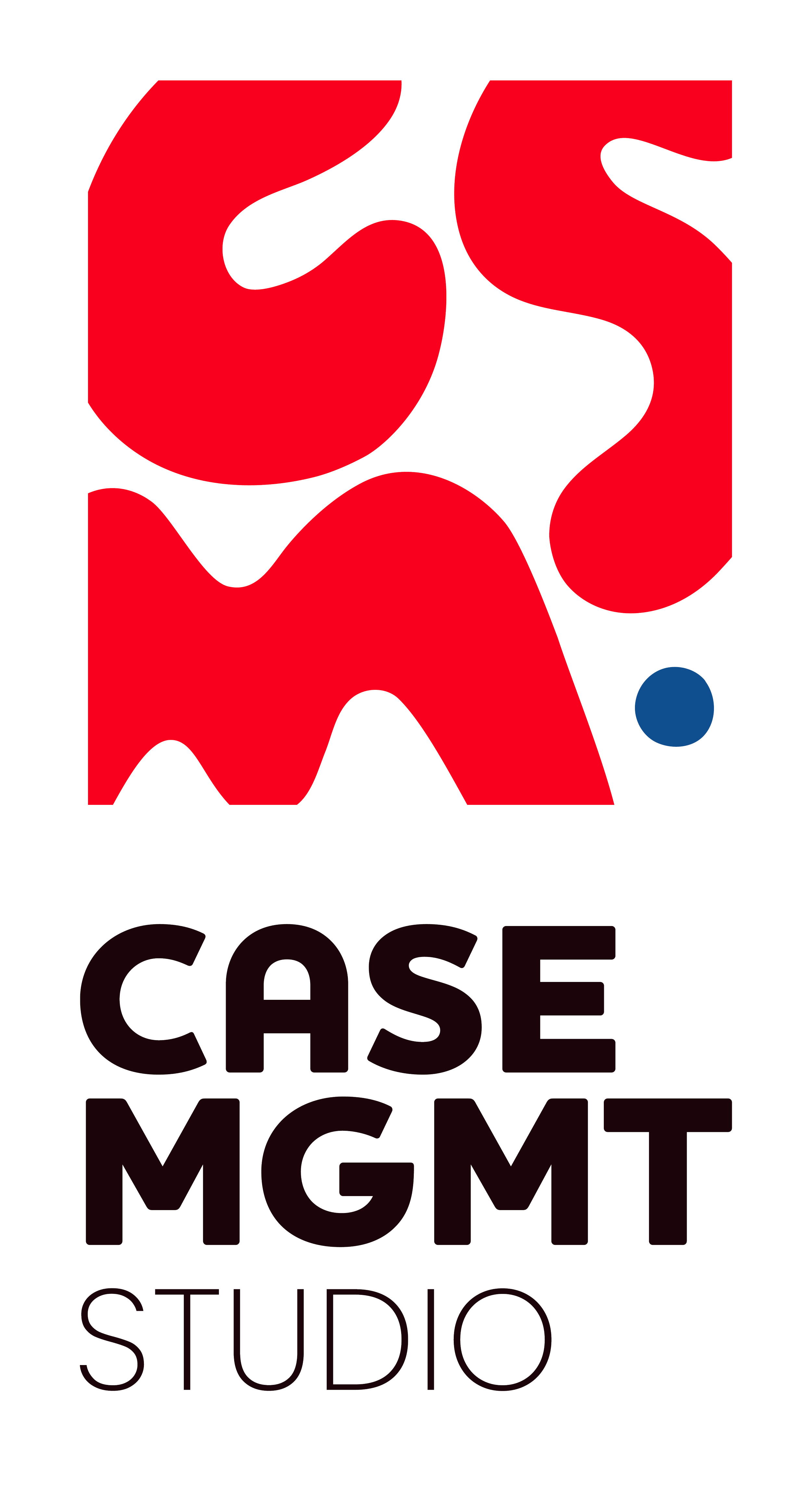
The CMS logo reflects learning as a dynamic, shared practice—one that evolves through experience, collaboration, and care.
The abbreviation of Management is intentionally shortened within the primary logo mark to create a tighter, more compact visual identity while maintaining flexibility through secondary logo applications.
The visual system combines fluid letterforms with structured design elements to represent the balance between human connection and professional practice.
The CMS Letterforms
The fluid, organic CMS letterforms represent:
The exchange of knowledge between students and staff.
The evolving nature of professional learning.
The pathways traveled through education, career development, and personal growth.
The forms subtly reference both:
The human brain and cognitive development.
The pathways and systems individuals navigate throughout their educational journey.
The Circle Element
The circle represents the human form preparing to move through the system.
It symbolizes:
The individual at the center of support.
Personal growth.
Movement through education and career development.
The human experience within structured systems.
The Structured Frame
The organic forms are intentionally contained within a structured frame.
This represents CMS as:
A supportive environment.
A thoughtfully designed learning system.
A place where professional skill-building can flourish.
The balance between fluidity and structure embodies CMS's mission:
Equipping case managers with the knowledge, tools, and confidence needed to provide holistic, high-quality support that helps students thrive.Visual Identity System
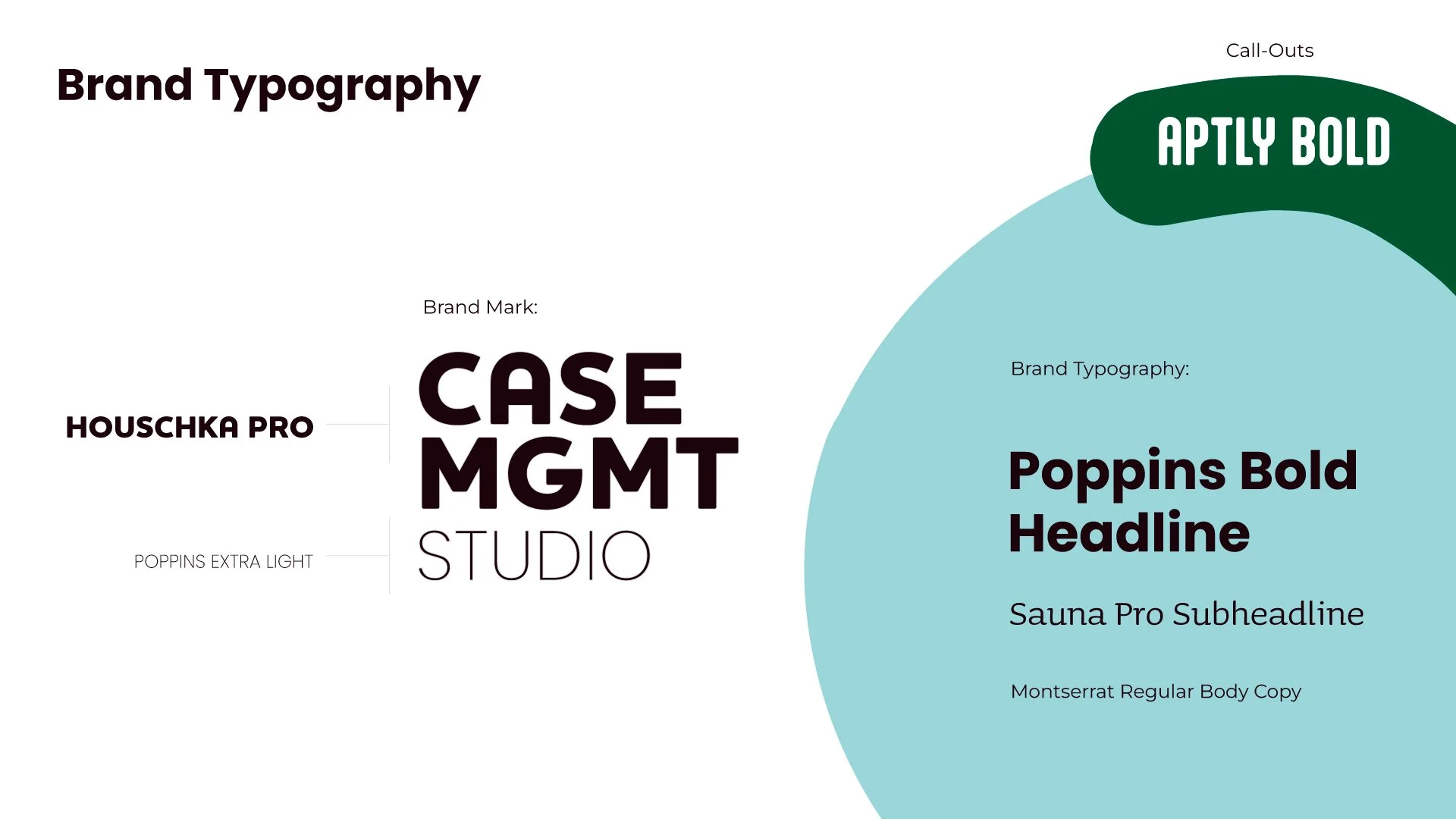
Visual Identity System
Beyond the logo, the brand system was designed to provide CMS with a flexible foundation for future communications.
The identity included:
Logo suite development
Primary and secondary logo applications
Typography hierarchy
Color direction
Graphic elements
Photography guidance
Brand usage guidelines
Marketing and communication recommendations
The goal was to create a system that could adapt across:
Educational materials
Digital communications
Training resources
Professional development programs
Internal and external presentations
Brand Guidelines
A comprehensive brand guideline system was developed to ensure consistency as CMS grows.
The guidelines established:
Visual Consistency
Clear standards for logo usage, typography, and design application.
Brand Flexibility
A system capable of supporting future programs, resources, and initiatives.
Strategic Alignment
A visual language directly connected to CMS's mission, vision, and teaching philosophy.
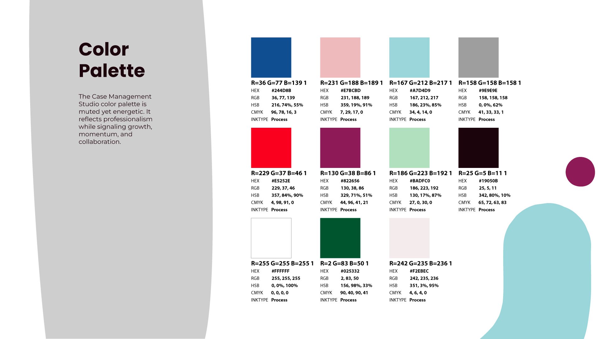
Design Philosophy
The CMS identity was intentionally designed to avoid traditional education clichés.
Rather than relying on expected academic symbols, the system focused on:
Movement
Connection
Growth
Collaboration
Human-centered support
The result is a brand that feels modern, professional, and aligned with the evolving role of case management in higher education.

Impact
The Case Management Studio brand identity created a foundation for a new educational initiative by transforming its mission and philosophy into a clear visual language.
The project successfully:
Established CMS as a recognizable and credible initiative within Dallas College.
Created a cohesive brand identity system from the ground up.
Translated complex educational concepts into accessible visual storytelling.
Developed a scalable framework for future programs and communications.
Provided CMS with the tools needed to communicate consistently as the organization grows.
Most importantly, the identity reflects what CMS represents:
A commitment to strengthening the professionals who help students navigate their educational journeys and achieve success.
Final Reflection
The strongest brands do more than communicate what an organization does.
They communicate why it exists.
For Case Management Studio, the opportunity was to transform an educational philosophy into a visual identity that could inspire confidence, encourage collaboration, and represent the future of professional case management.
The final identity serves as both a reflection of CMS's mission today and a foundation for the impact it hopes to create tomorrow.