Rebel Creamery Rebrand Concept
Independent concept created as a strategic branding exercise. Rebel Creamery is not a client.
Rebel Creamery
Rebrand Concept | Brand Strategy & Packaging Design
Overview
Following the recent trade dress ruling involving Rebel Creamery's packaging, I saw more than a packaging problem. I saw a brand opportunity.
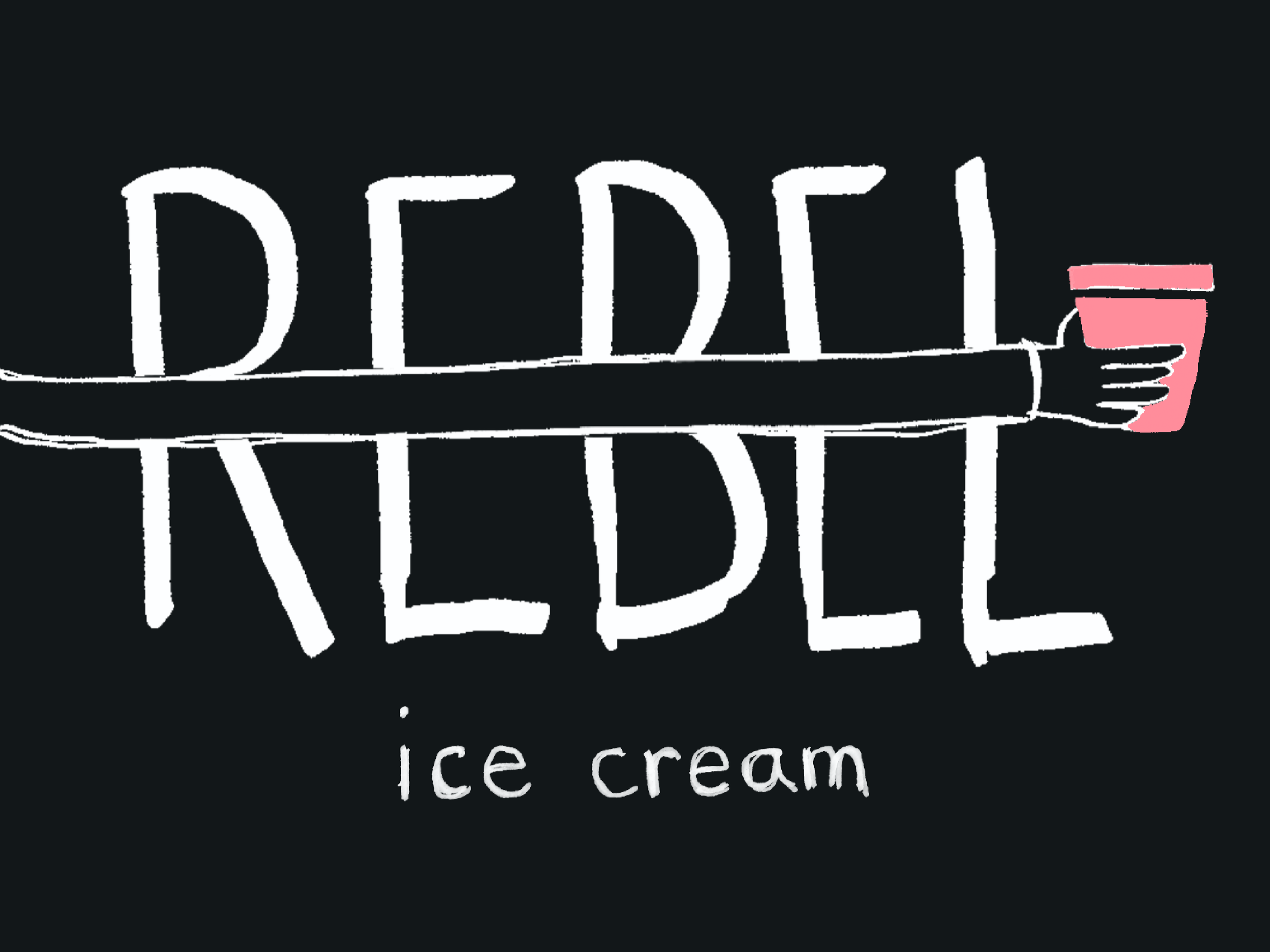
If your name is Rebel, every touchpoint should reinforce that idea. Rather than simply redesigning the carton, I explored what it would look like if the entire brand embraced a bolder personality built around questioning convention.
The Opportunity
Rebel already owns a compelling product story: real dairy, full-fat ingredients, and almost no sugar. I wanted to elevate that into a stronger emotional brand story.
Instead of competing within the familiar "premium ice cream" category, I repositioned Rebel as a brand that challenges outdated food rules—without sacrificing indulgence.
Brand Platform
QUESTION THE RULES
Great ice cream doesn't need sugar.
ZERO REGRETS
Dessert shouldn't come with guilt.
Creative Direction
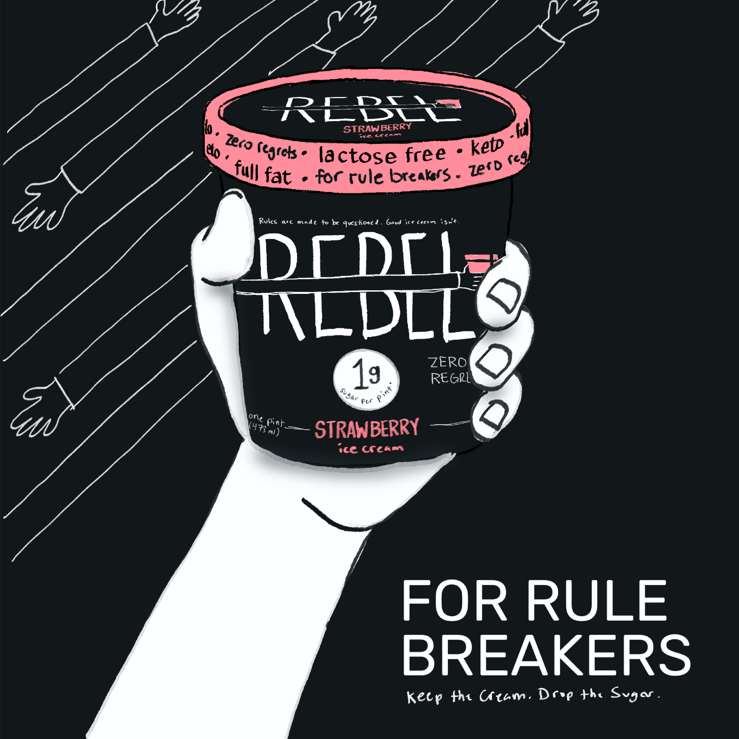
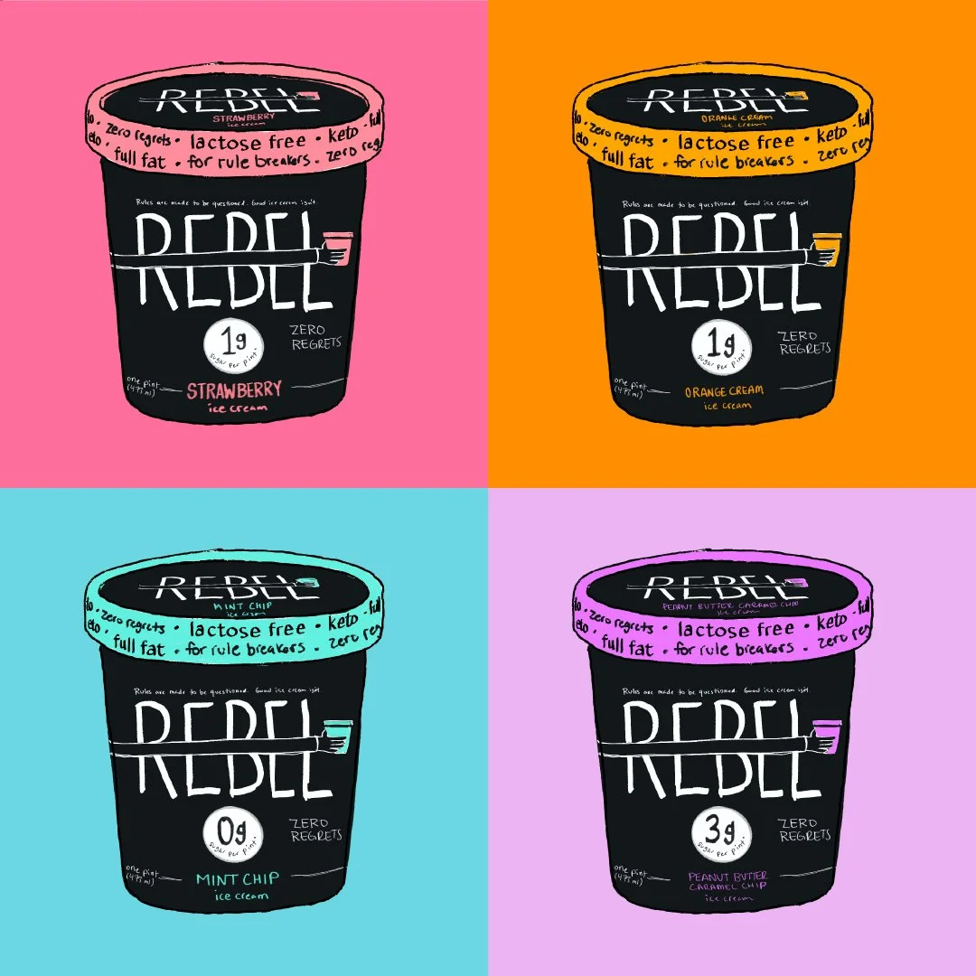
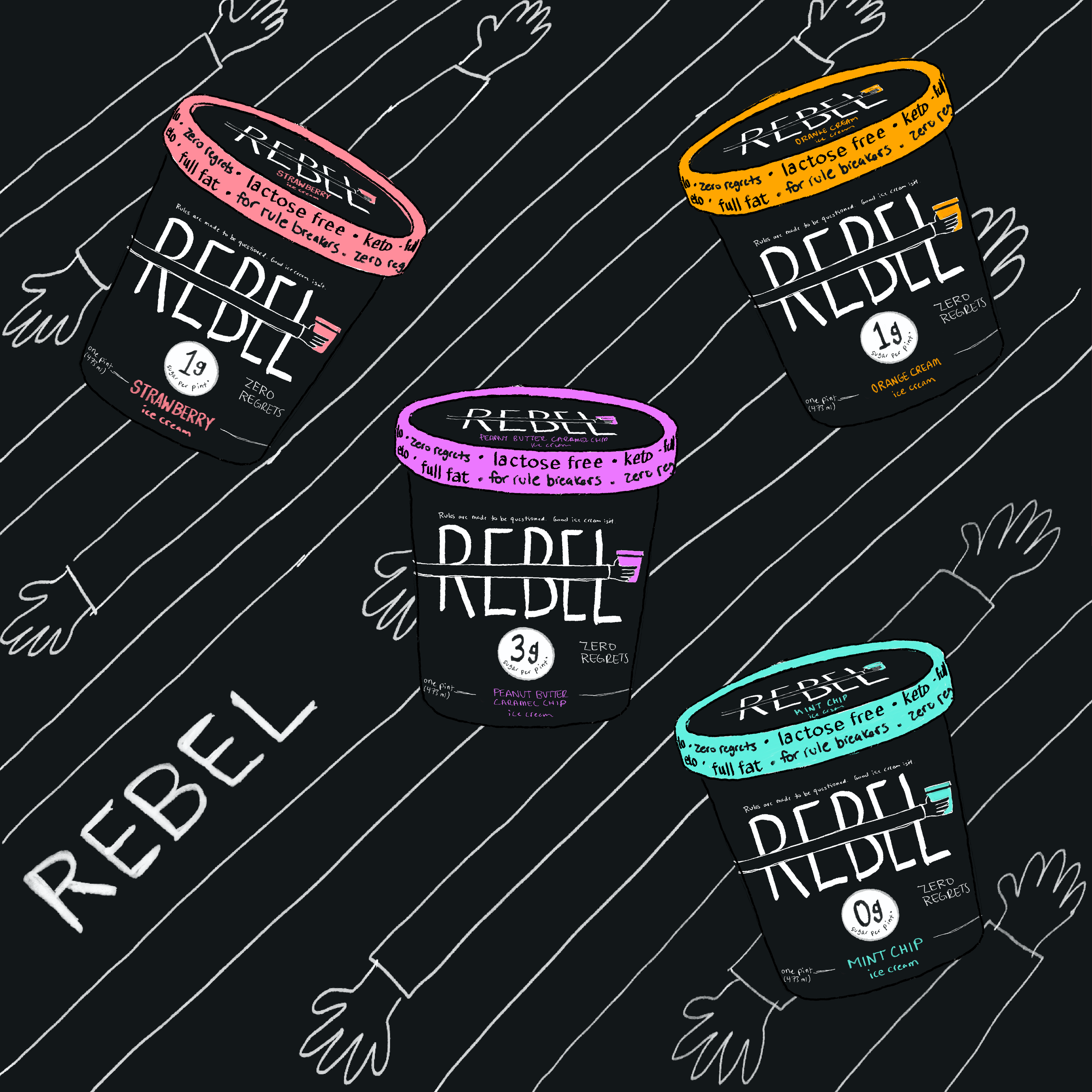
The visual identity shifts away from soft, premium minimalism toward something more expressive and unmistakably Rebel.
Hand-drawn typography and illustration
High-contrast black packaging with vibrant flavor cues
Playful, imperfect graphic elements
Bold messaging that reinforces the brand's attitude
The result is a packaging system designed to feel less like another pint of ice cream—and more like a brand with something to say.
Project Scope
Brand Strategy
Brand Positioning
Creative Direction
Packaging Design
Art Direction
Copywriting