
Case Study - Reimagining TACA
Transforming a Legacy Arts Organization Through Brand Strategy, Visual Identity, and Community Storytelling
Organization: TACA
Year Launched: 2024
Role: Creative Director / Brand Strategist
Scope: Brand Strategy, Visual Identity, Messaging, Brand Architecture, Digital / Print / Event Applications
Executive Summary
TACA has spent more than five decades supporting and strengthening the Dallas arts community through grants, advocacy, and partnerships with local arts organizations.
While the organization had built significant recognition and equity throughout North Texas, its public identity did not appropriately reflect the vibrancy, creativity, and diversity of the community it represented.
Historically known as The Arts Community Alliance, the organization had evolved organically into simply TACA. The original name had become less meaningful to audiences, while the TACA acronym had developed its own brand recognition and legacy.
The opportunity was not to create a new identity—it was to redefine the meaning behind an existing one.
Through a comprehensive brand refresh, I helped TACA transition from a traditional nonprofit identity into a more modern, energetic, and community-focused arts organization. The work included redefining the organization's positioning, refining messaging, creating a new visual identity system, and establishing a more cohesive brand experience across programs and communications.
The result was a refreshed brand platform that better reflected TACA's mission: supporting the artists, organizations, and communities that make Dallas a thriving cultural destination.

The Challenge
TACA had built a respected legacy within the Dallas arts community, but its brand identity had not evolved at the same pace as the organization itself.
The organization faced several challenges:
The formal name, The Arts Community Alliance, no longer clearly represented how audiences experienced the organization.
The acronym TACA had stronger recognition and brand equity than the full name.
Existing visual elements did not fully reflect the creativity, energy, and diversity of the arts community.
Program identities and communications lacked a unified brand system.
The organization needed a clearer way to communicate its role as a connector, advocate, and supporter of the arts.
The challenge was not awareness.
The challenge was meaning.
How could TACA honor its history while creating a modern identity that better represented its future?
The Insight
Strong brands do not always need to explain themselves.
Over time, TACA had already become the organization's most recognized and meaningful identifier. Rather than continuing to rely on a descriptive name that no longer resonated, the strategy was to embrace TACA as the brand itself.
The decision was made to move away from using The Arts Community Alliance as the primary public-facing identity and allow TACA to stand independently.
This created the opportunity to redefine what TACA represented:
Not simply an arts alliance.
But a champion of creativity, collaboration, and cultural impact throughout Dallas.
The Brand Strategy
The rebrand focused on three core objectives:
1. Clarify the Organization's Purpose
The first priority was creating a clearer understanding of TACA's role within the arts ecosystem.
The refreshed brand positioned TACA as:
A supporter of artistic excellence
A connector within the Dallas arts community
A resource for organizations and artists
A champion for cultural growth and accessibility
The goal was to move beyond being perceived simply as a grant-making organization and instead highlight TACA's broader role in strengthening the arts community.
2. Modernize the Visual Identity
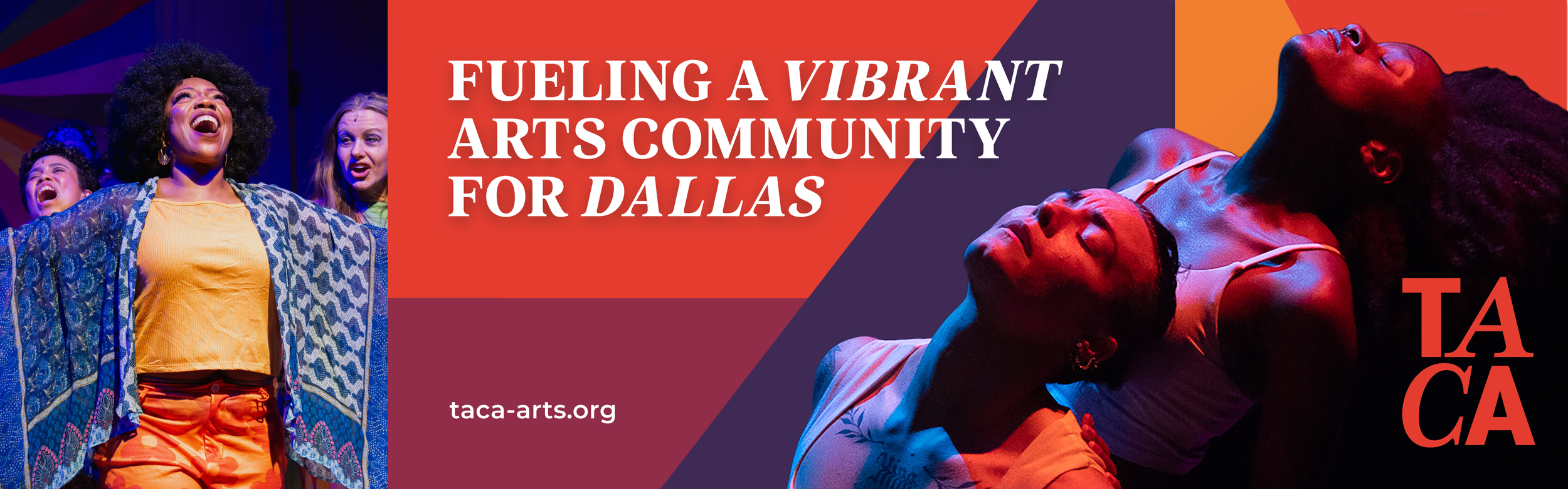
Because TACA represents the arts community, the brand needed to feel creative, vibrant, and dynamic.
The updated visual identity was designed to:
Reflect the energy of Dallas' arts scene
Create a stronger emotional connection with audiences
Provide flexibility across digital and physical applications
Establish a recognizable system for future growth
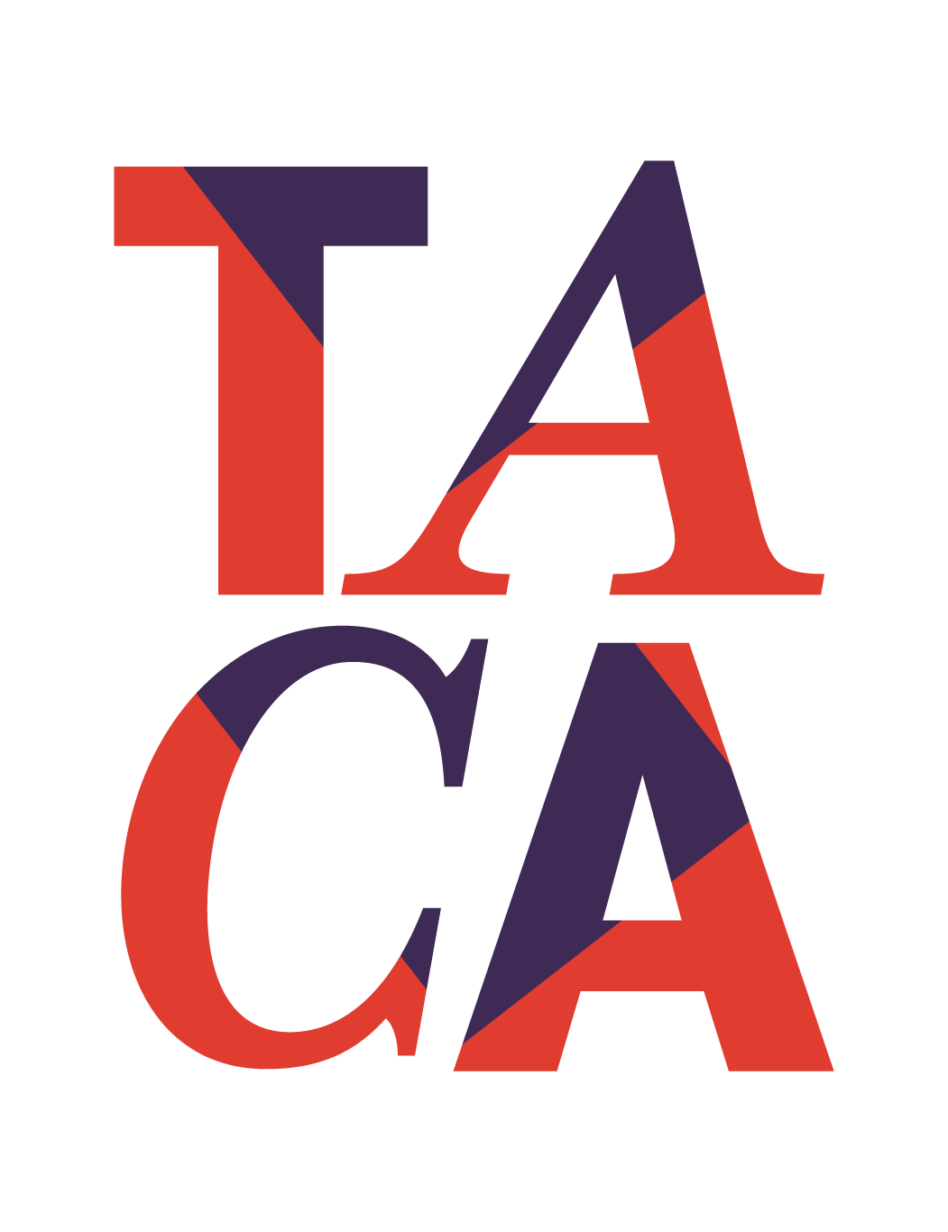
The updated brand introduced a more expressive visual language through:
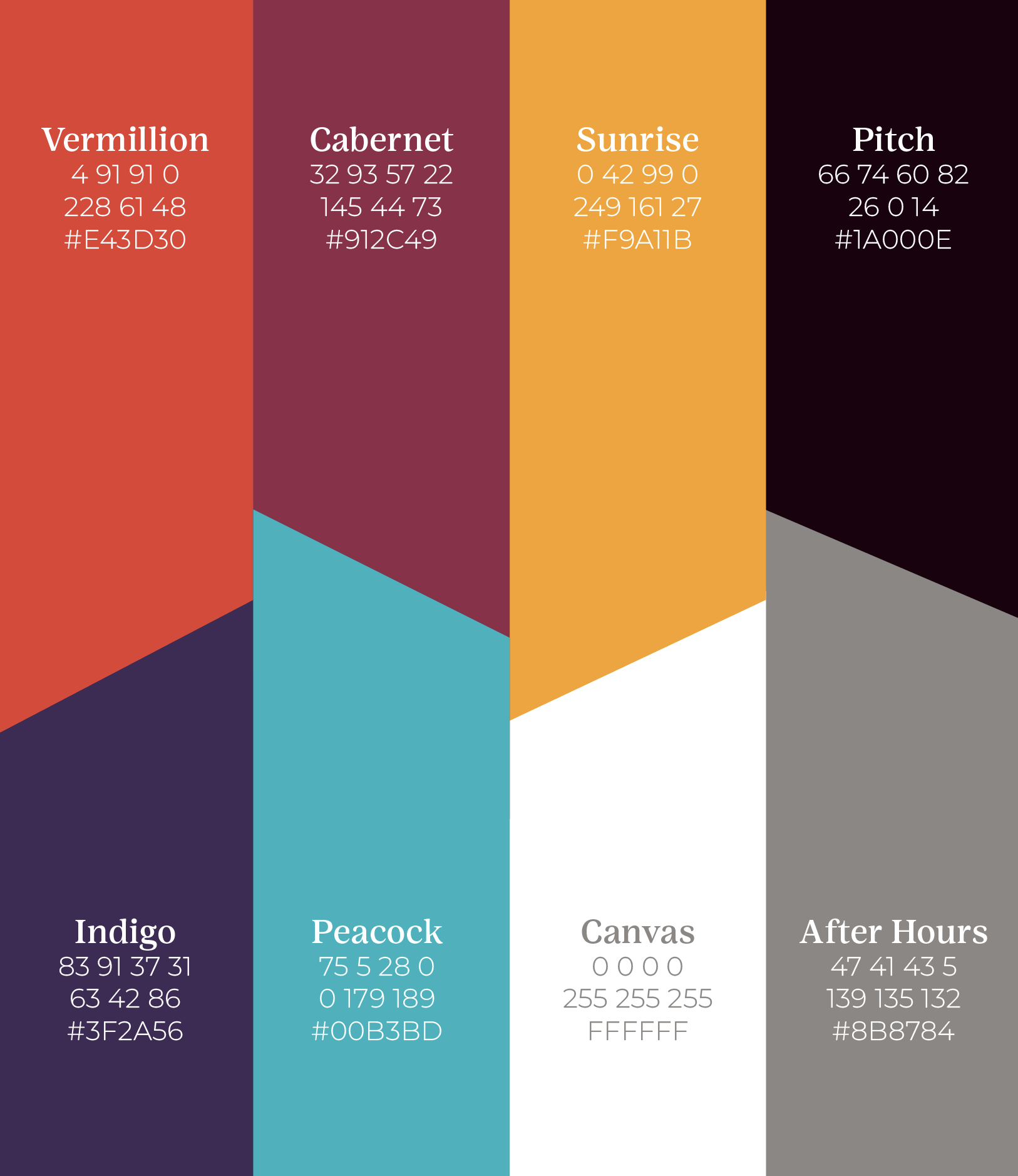
A refreshed color palette
Modern typography
Dynamic graphic elements
Flexible design applications
A more engaging digital presence
The goal was not simply to make TACA look newer. The goal was to make the brand feel more alive.
3. Create a Cohesive Brand Architecture
TACA supports a variety of programs, initiatives, and community efforts.
One of the opportunities was creating stronger alignment across these offerings while ensuring every initiative continued to build equity for the parent organization.
The updated brand system created:
Greater consistency across programs
Stronger connection between initiatives and TACA
Improved audience recognition
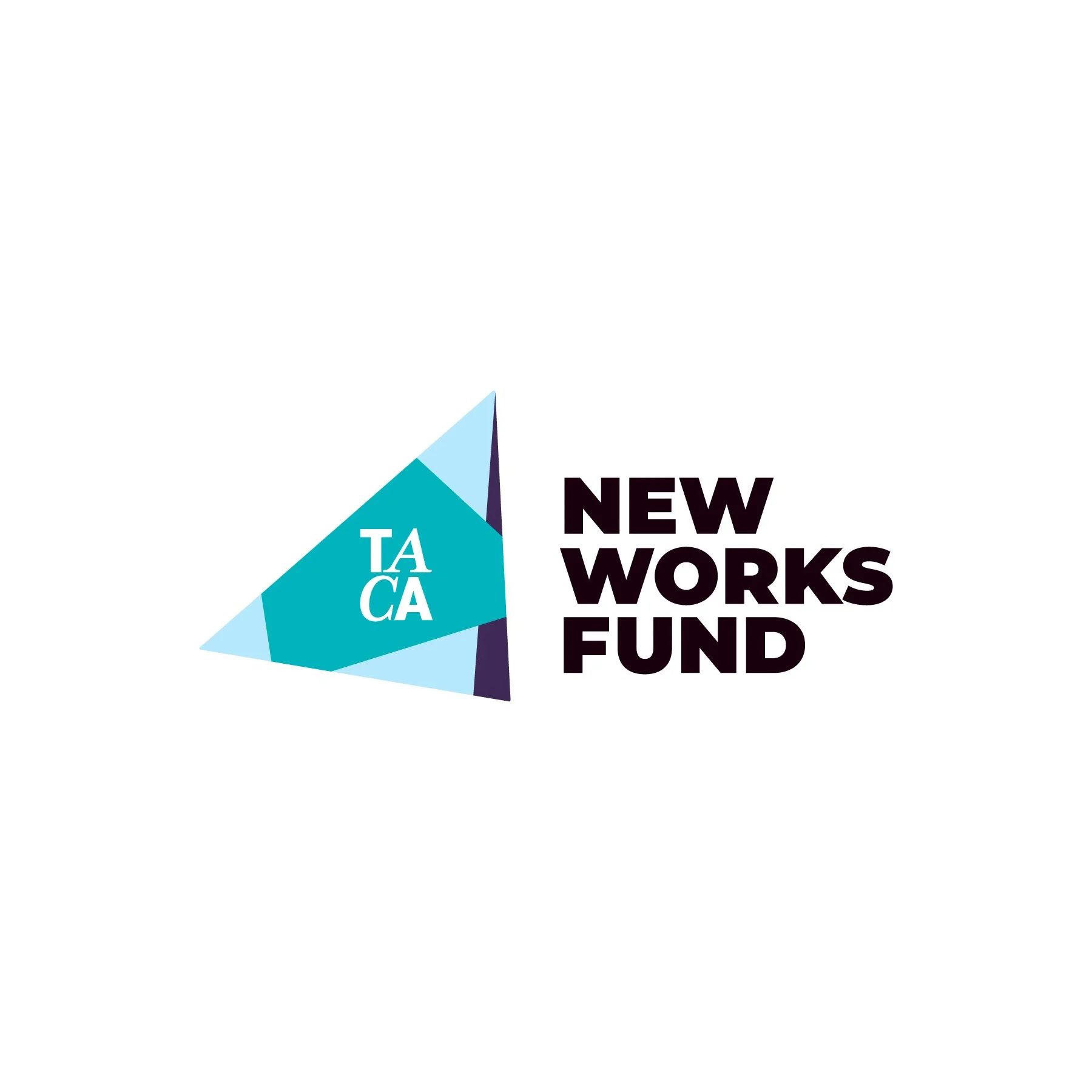
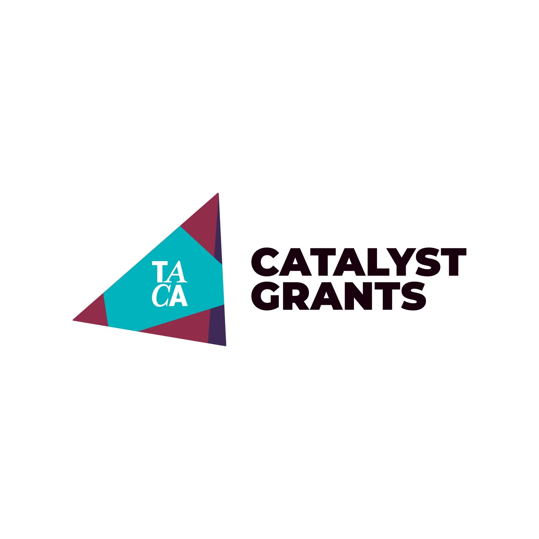
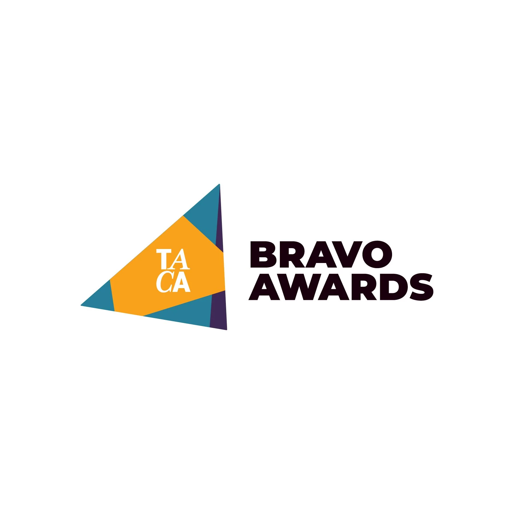
A scalable framework for future programs
Each program could maintain its unique personality while reinforcing the larger TACA brand story.

Messaging & Positioning
A major component of the rebrand was ensuring that TACA's messaging matched its updated identity.
The new messaging focused on:
Community
TACA exists because of the artists, organizations, donors, and supporters who make Dallas' arts community thrive.
Connection
TACA serves as a bridge between artists, organizations, supporters, and audiences.
Impact
Through funding, partnerships, and advocacy, TACA helps strengthen the cultural fabric of North Texas.
The updated messaging allowed TACA to better communicate not only what it does, but why it matters.
Implementation
The rebrand was designed as a complete brand experience, not simply a visual update.
Applications included:
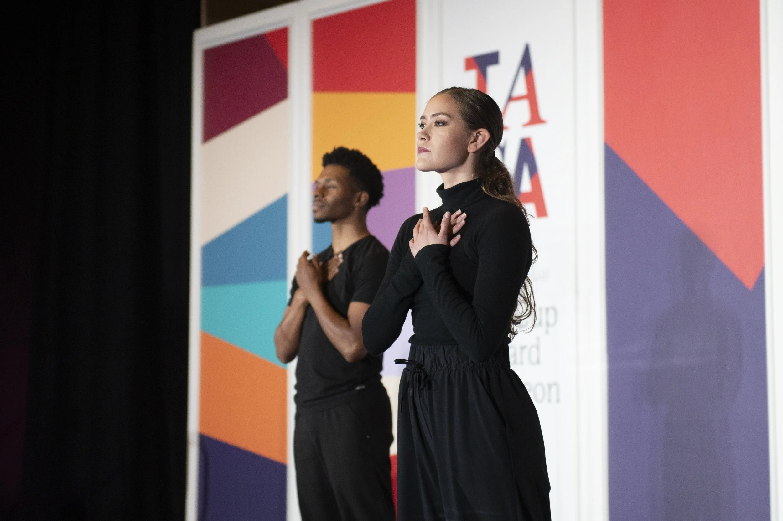
Website experience
Digital communications
Social media presence
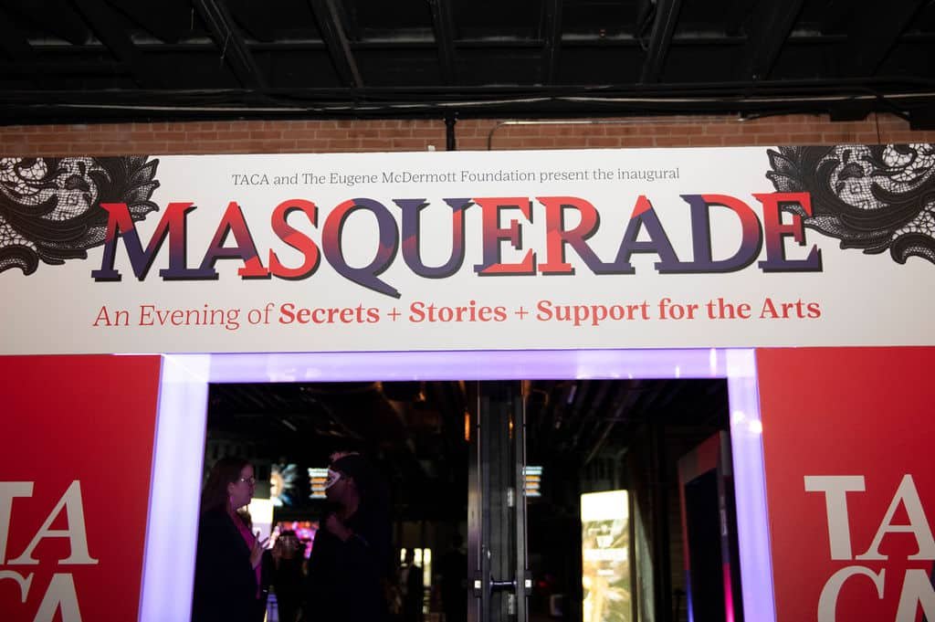
Event materials
Program collateral
Marketing assets
Community-facing communications
The new identity provided TACA with a more flexible and sustainable system that could evolve alongside the organization.
Impact
The TACA rebrand created a stronger foundation for the organization's next chapter by aligning its visual identity, messaging, and community presence.
Key outcomes included:
Transitioned from an outdated descriptive name to a stronger standalone brand identity.
Created a more vibrant and modern visual system reflective of the arts community.
Developed clearer messaging around TACA's purpose and impact.
Established stronger consistency across programs and communications.
Created a scalable brand framework for future growth.
Improved the organization's ability to tell its story to donors, artists, partners, and the broader Dallas community.
Most importantly, the rebrand helped TACA better represent the community it exists to serve.
Final Reflection
A successful rebrand is not about changing how an organization looks.
It is about creating alignment between who an organization has been, who it is today, and who it wants to become.
For TACA, the opportunity was not to abandon its history—it was to honor decades of impact while creating a brand identity capable of carrying that legacy forward.
By embracing TACA as the brand and redefining what it represents, the organization gained the flexibility to tell a stronger story, connect with new audiences, and continue supporting the arts community for generations to come.